VS PINK App
VS PINK App
The PINK app showed lots of promise but wasn't yet impacting the business. The relaunch had to deliver results, but couldn't betray the playful DNA of the brand that makes it such a hit. So, we updated the UX to make the experience a series of micro gaming experiences, with a special emphasis on Special Offers (scratch off like a lottery ticket) and New Arrivals. At the time, a little-known app called Tinder was taking off with our audience, so we tested a swipe left / swipe right model for shopping New Arrivals, and the result was $1mm in incremental sales in the first quarter.
Home
The home screen was designed to keep a ravenous audience of brand loyalists engaged. We stayed curious and playful as we designed a suite of micro interactions that worked to bring static promotions to life.
New Arrivals
For the all-important New Arrivals feature, we found that our users were starting to experiment with a new app (at the time) called Tinder. We took a look at the UX of that app, and developed a unique take on the swiping behavior that was already becoming second nature for the PINK girls.
The PINK Camera
For an audience that was regularly getting bored with Instagram filters, we created the ability to create a completely different look for their social photos. It was up to each user whether or not to include branded elements, and how much to alter their photos. As we refined the flow from taking photos to posting them, we build a dedicated user base for the feature.
The fun stuff
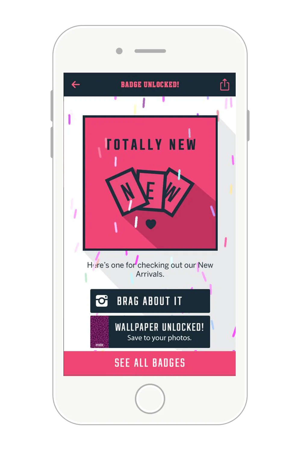
We loaded the app with fun features like badges and wallpapers that yielded very powerful data about the user' behavior and motivations, which was key in developing the later, more robust loyalty program for PINK Nation
The brand updates
As part of the process, we extended the PINK brand in digital to accommodate the new product features, as well as to create a cohesive visual language to be used across mediums for campaigns and promotions. The result was a new, cheeky way to connect with the PINK audience.


